A must if you want to create a logo! Brand mark creation manual for not failing!
Once you have a brand concept, you will create a brand name and a brand logo or symbol mark (also known as a logo mark).ります。
When I create a logo, I ask a designer because I can't do it myself.す。
Even if you lightly think that you are safe because you are asking a designer, the finished product often turns out to be different from what you imagined.す。
In this case, there is a high possibility that you are not communicating your feelings clearly.す。
So, this time, I would like to summarize the basic knowledge and things to prepare when asking a designer, including organizing my head.ます。
※This article is not for designers, but for those who want to ask designersす。
basic knowledge
Before asking for a design, I will first talk about the basic knowledge.Knowing the basics will make it easier to set up the structure, so there is no loss in knowingいです。
Difference in logo markい
「For those of you who don't know what you're talking about, like the logo symbol, let's first look at each pattern visuallyみましょう。
logo type
First, let's look at the logotype. What is a logo?か?
logo type (logotype) is a stylized and decorated character string, which is used to print and display group names, trade names, product names, magazine titles, etc.する際に使用される。logo sometimes abbreviated
Derived from the Greek word logotyphos (λογότυπος), which consists of logo = word type = type and originally meant digraphs for one word.味した。
『Wikipedia logotype』Than
In other words, it's a brand mark made up of words.ょう。
you all know thisGoogleis the logo of。Logotype because it is made only of lettersプ is。
Origin of the logo
It seems that the three primary colors add a sense of playfulness, emphasizing that anything is possible by not making things complicated. Only the letter L uses colors that are not in the three primary colors, making it clear that the company is not bound by rules. The point is that we are constantly releasing new services one after another.出し続けていますから。
『Did the corporate logo of the IT industry have such an interesting meaning?か!?』
When it comes to google, the logo on the search screen of the browser changes every day.ですね。

Next is the logotype of LOFT (Loft), which is famous as a design by Mr. Ikko Tanaka。
「Loft means an attic room.At the time of its founding in 1987, loft culture by young artists was becoming a movement in Soho, New York. was given名付けられました。
『Loft official website』Than
It's very impressive because of the black and yellow color scheme that indicates caution.ね。
symbol mark
symbol mark is a design mark that symbolizes the family company, group, individual, etc.匠、マーク。
The mascots of events such as international sports competitions are also a kind of fish mark, which was used in ancient times during the Roman Empire. There are many interesting things such as the mark design of the signboard of the storeなども面白いものが多い。
『Wikipedia symbol mark』Than
To put it simply, it's Mark.ね。

McDonald's symbol mark。
Origin of the logo
「You might think that the M logo is McDonald's M, but that's not the case. There are two large golden arches on both sides of the building that run from the ground to the roof. The M logo, which looks like the letter M, is based on these two arches.チが原型となったのだそう。
『From mynaviり
It doesn't look like the initials of McDonald's.かりますね。

Apple is the No. 1 brand value that everyone knows now. It is said to have been created byれたとのことです。
In this way, unlike logotypes,、The symbol mark is easy to remember there is a characteristic。
By the way, this symbol mark is elaborately calculated and most of them areどが「Golden ratio」Composed by a Brazilian visual designerナーThiago BarcelosMorewas discovered by Mr.。

By the way, it seems that the bird of Twitter's symbol mark also uses the golden ratio.だ。
Logo
A logo mark is a mark of a logotype.の is。

FedEx, a major international courier companyるんです。
The FedEx logo is highly acclaimed around the world and is always featured in the logo design feature.す。

It's a little hard to see in the logo, but we put an arrow shape in the space between E and X to express the speed and accuracy of delivery as a hidden message.ージとして表現しています。
It is made to spread by word of mouth that people who know this hidden message will want to talk about it, and this word of mouth is actually featured in the media all over the world.ます。

The Bridgestone brand mark marks the initials of the logo.す。
This makes it a logomark instead of a logotypeす。

When you think of red, you think of Coca-Cola. Coca-Cola is said to be red.るブランド。
This Coca-Cola is also a logotype markね。
symbol mark logotypeプ
Finally, introducing the combination of the symbol mark and the logotype。

It is a Microsoft brand mark.It is a combination of the symbol mark on the left and the logotype on the right.です。
The symbol mark, which has four colors arranged in a square, indicates a wide variety of product portfolios, and the Segoe font is used for the logotype.います。

Pepsi also has a symbol mark on the left and a logotype on the rightイプ。
The creator of the logo creates a beautiful design using the Pythagorean theorem and the golden ratio, and uses the earth's magnetic field and geodynamic relativity theory to attract more customers.そう。
Also, by applying the idea of the gravitational pull of light in outer space, the gravitational force is calculated so that when people walk down the aisle, they are unconsciously pulled by the Pepsi-Cola logo on the shelf.だとか。
That should be the case.The production cost for this brand mark is 100 million yen.It took 5 months to create 27 pages of design materials.いですね。
By the way, when I checked it, it seems that the creation cost of Google and Coca-Cola Microsoft is 0 yen.うです。
There are even large companies doing it for free, so I would like to use as little money as possible for small businesses and startups.ね。
Think from 4 types
- logo type
- symbol mark
- logotype markup
- symbol mark logotypeプ
Keep these patterns in mind when creating your own brandmarkい。
Features of each pattern
Here, I would like to talk about the characteristics of the logotype and symbol mark that I introduced earlier.す。
※I will omit the logotype marking and the symbol mark logotype because they are a combination.す。
Characteristics of the logotype
- Easy to remember brand name
- Expected promotion effect
If you want people to remember your brand name, we recommend the logotype because the logo itself becomes the brand name.メです。
I once found a bag with a wonderful design while walking around.た。
I was intrigued and looked to see if the brand name was written on the bag, but only the symbol mark was written, not the logotype, so in the end I couldn't tell which brand it was.せんでした。
If things are good like this, people like me who are walking down the street and people around consumers will have an advertising effect.す。
Also, if you want to remember the brand name, you can't even know it without the brand name like this bag.せん。
for those reasons、「You can expect an advertising effect that makes it easy for people to remember the brand name, but the characteristics of the logotypeの特徴 can be said。
Features of the symbol mark
- Impressive
- more reliable
The symbol mark is effective when you want people to remember the brand concept or mark rather than the brand name.効です。
The shape of the bag symbol, which I mentioned in the logotype feature, is recognizable even from a distance, and it still remains in my memory.いです。
Imagine yourself using the logo of a famous companyを。
For example, sports maker Nike uses a very simple mark that expresses a sense of dynamism and speed.ています。

When you go out, take a look at the logos and marks from this kind of perspective. I think you will realize that the marks are easier to remember than the letters and are easier to recognize.います。
And if you know the meaning of the mark, it will be easier to remember.す。
Also, the fact that there is a mark shows the degree of seriousness with which you are working to realize the concept.人もいます。
Even if we don't know the brand's intention to create it, we unconsciously judge and perceive these parts.す。
that's why、A symbol mark is recommended if you want to emphasize impressions, demands, and credibility.メ is not it。
Proper use of symbol marks and logotypes
Now, I have talked about each feature of the symbol mark and logotype, but I think you will get lost when you actually create it.ると思います。
Therefore, I will also tell you that there is a way to create both a symbol mark and a logotype and use them properly.す方法です。
As I mentioned earlier, the symbol mark has an impression and credibility, and the logotype has the effect of recognizing the brand name.のです。
to people who don't know you 「Your name Your face Which one do you want me to remember first?たいのか?
It's easier to understand if you compare yourself to a brand like this。
For example, on Facebook, do you want to be friends with people who don't show their faces?か?
In this case, you have to give priority to the face (symbol mark)ん。
Then, when sending an email, what if only the face is sent without the sender's name?ですか?
In this case, I'm more worried about not having a sender's name than a face.りです。
By the way, you can mark the logotype. In this case, you only need one, so you don't have to think too much.ます。
Features of each color
Next, let's take a look at the characteristics of each color. Use this as a reference when choosing a color.い。
white (white)

feature
- give confidence。
- best color for health。
Impression to give
- give a clean impression。
- Make things feel lighter than they actually are。
- feel the beginning。
- Feel less dirty。
- refresh your mood。
- make you feel spacious。
association image
- Unreliable
- possibility
- light
- health
- justice
- peace
- pure
- bland
- Nothing
- bright
- cold
- emptiness
Company using
- Cup Noodles
It is often used for backgrounds, etc., but there are not many brand marks with a white image color.ね。
black (black)
feature
- give strength and authority。
- Great effect on other colors when combinedい。
Impression to give
- make things feel heavy。
- give a feeling of strength, pressure, authority, etc.せる。
- give a sense of luxury。
- assert oneself。
- make me feel dark。
- accelerate aging。
association image
- cool
- rock bottom
- evil
- dark
- Fear
- rejection
- loneliness
- Luxury
- mystery
- gravity
- masculine
- Faithful
- spooky
- anxiety
- ruthless
Company using
- NIXON
- NES CAFE
- mini
- Nike
red (red)

feature
- High visibility effect。
Impression to give
- energize and move forwardる。
- arouse excitement。
- feel heat or warmth。
- increase appetite。
- attract interest。
association image
- self-assertion
- life
- anger
- strife
- passion
- tension
- active
Company using
- JAL
- coca colaラ
- YouTube
- docomo
- Rakuten
blue (blue)

feature
- improve concentration。
Impression to give
- improve concentration。
- appetite control。
- calm down。
- feel the flow of time slowing down。
- promote sleep。
association image
- delicate
- openness
- peace
- cool
- sleep
- composure
- Faithful
- cold
- ruthless
Company using
- ANA
- freee
- SAMSUNG
green (green)

feature
- give a sense of security。
Impression to give
- heal the mind and body。
- rest tired eyes。
- relieve tension。
- has a relaxing effect。
- feel calm。
association image
- ecology
- Refreshing
- relaxation
- safety
- recovery
- environment
- hope
- reproduction
- life
- Youth
- conservative
- immature
Company using
- Nitori
- Starbucks
- Evernote
- LINE
yellow (yellow)

feature
- give a bright impression。
Impression to give
- to concentrate。
- exercise judgment。
- improve memory。
- call attention to。
- lighten the mood。
association image
- bright
- fun
- active
- Novel
- tension
- light
- Youth
- Note
- development
- anxiety
- childhood
- Cheerful
Company using
- Yamato Transport
- loft
- McDonald's
- cocos
amber (orange)

feature
- make a positive impression。
Impression to give
- increase appetite。
- feel cheerful。
- Gives energy and openness。
- Increase friendliness and camaraderie。
- relieve tension。
association image
- warm
- vitamin
- vitality
- health
- well
- curiosity
- confidence
- Sociable
- look down
- Self-indulgence
Company using
- Mixi
- Hermes
- Amazon
- Daiei
peach color (pink)

feature
- Give a soft and gentle impressionる。
Impression to give
- feel happy and kindる。
- Rejuvenate your mind and body。
- look adorable。
- get peace of mind。
- begin to seek love。
- relieve tension。
association image
- Idol
- erotic
- Feminine
- beauty
- romantic
- openness
- Gratitude
- sweet
- heart
- vulgar
- childish
- delicate
- unstable
Company using
- peach
- Baskin Robbins (Japan's Thirty One))
『color color』reference
Points for creating a brand mark
Here's a quick summary of the points to keep in mind when making。
be simple
I've talked about it many times, but by making it simple, it will be remembered and used for a long time as I wrote below. This is the first point to consider.です。
Unforgettable
Brandmarks are simple and easy to remember and remember.ょう。
can be used for a long time
The logo is not something that changes in a year or two. Let's aim for something that can be used in the long term, such as 10 years, 20 years, 100 years.しょう。
Flexible
The completed brand mark can be used everywhere. Envelopes, documents, products, packages, stores, etc. Let's create something that can be used anywhere.あげましょう。
acceptable to everyone
It may be fine if you act only in a limited area, but if it is not something that can be accepted by any person, including nationality and ethnicity, you will narrow the scope of your activities yourself.ます。
What to prepare to make a request
Now, we will prepare the necessary preparations to actually request the creation of the brand mark.。
put together a concept
Before creating the brand mark, let's first create a brand concept.さい。
How to create a brand concept『How to create a brand concept that anyone can do in 3 steps方』Please refer to this as it is written in。
In the case of Rashical, you can unburden yourself and realize a light and stress-free life and a rich life and society.々準備します。
Origin of the name?
This is also helpful for the designer when designing, so please let us know.い。
The name comes from the concept『32 selections of 5 patterns that will be helpful when naming a brand』Please refer to the reference article for naming。
In the case of radicals, I自分Like nine、Light Combining Rashi and Cal of Living Radical」
write out business
Please write down what you will be doing in the future.。
In the case of Rashical, it feels like developing and selling products that express a simple life and your own personality and enrich your life, as well as providing information to realize them.うような感じです。
tell the audience
Target audience、「Publishing high-quality persona analysis and how to create it開」This is an article about。
What do you want 10 or 20 years from now?か?
Of course, I don't know what it will be like in 10 years, but it's okay to have an image of it.さい。
In the case of Rasical, our aim is to provide products and information of our brand around the world and help to propose a rich life on a global scale.こと」です。
prepare a logo you like
Collect logotypes and brand marks that you think are good.。
Just by looking at it and telling the designer which part you like, whether it's the atmosphere or a part, it will be easier to convey the image.ります。
Examine Competitor Logos
See what type of logo your competitors are using。
Simple or complex, classic or advanced? Based on this information, I think about where my logo should stand out and convey it to the designer.に伝えます。
Decide on a color, but don't let the color fool youい
The impression varies greatly depending on the color, so let us know from the beginning if there is a color you want.ょう。
However, since the silhouette is also important for good symbols that can be used for a long time, it may be better to have two patterns made, one in black and white and one in your favorite color.せん。
How the logo is displayed
Decide which notation to use, such as kanji katakana for Japanese hiragana uppercase and lowercase for Englishください。
Decide on the type of brandmark
This is the type of brand mark that I mentioned in this article, so please think carefully as the content will change greatly depending on your choice.さい。
what part do you want to emphasize??
If you tell me the parts to be emphasized in advance, it will be easier for you to get what you want, so I will tell you all the parts that I know in advance.す。
For example, the color you want to keep simple is red The image of the logotype design is something like Googleものなど。
First impression required for the brand mark
If you tell the impression you want, it will be easier for the designer to imagine.。
In the case of Rashical, I wanted a simple impression that is easy to remember.した。」

This is what I madeた。
If you can submit these to the designer collectively, you will be able to create something that is quite close to the image.ます。
Find a designer
Once you're ready, the next step is to find a designer.。
There is a site where you can request a designer, so I would like to introduce various things with comments.。
crowdworks

Crowdsourcing site Crowdworksス」。
Not only logos, but also brand name proposals, icon illustration creation research system construction, etc. Various people are registered, so there are a wide variety of jobs that can be requested.I often request via here.頂いています。
Lancers
「Lancers」

「Lancers is also a site similar to CrowdWorks, and you can make various requests other than logos.The registrant layer may be slightly different.せん。
CrowdWorks is the same, but there is a request method called competition (abbreviation of competition, which means competition), and even if the logo creation request amount is about 20,000 yen, you can receive 20-30 proposals, so I recommend it.です。
logo expert

It is a company that specializes in logo production, so it seems that you can trust them. The price is 29,800 yen, and there are more than 3 proposals.るそうです。
logo market

「Logo Market is a type that buys logos that have already been created by Logo Market, rather than requesting them. The price varies from 19,800 yen to 59,800 yen depending on the design.なります。
It seems difficult to choose, but there seems to be a service called logo concierge. We also have a trademark registration with a patent attorney office for 63,700 yen, so it's a good deal.ですね。
logo plus

This is a service that sells a lot because it's linked to trademark registration, but it's expensive, so I can't recommend itせん。
There are various services, but if you want to do it cheaply, I think it is better to ask Crowdworks or Lancers.す。
It's better not to spend a lot of money at the time of startup, so I think it's okay to register the trademark after you're ready for the activity and have confidence in its success. If you can't do activities just by doing it, you won't have any children.すからね。
Reference site
Finally, I will post a site that will be a reference for ideas。
『logofury』
『dribbble』
Preparation is important事
As I told you, some companies spend a lot of money on their logos.めです。
Although it is difficult for individuals and small and medium-sized enterprises to realize it, value will definitely be created in the future if they continue to carry out activities in line with the brand concept.ます。
Let's prepare for the logo production firmly for the future and proceed to become a proud symbol.う!
Rasicalのおすすめ商品
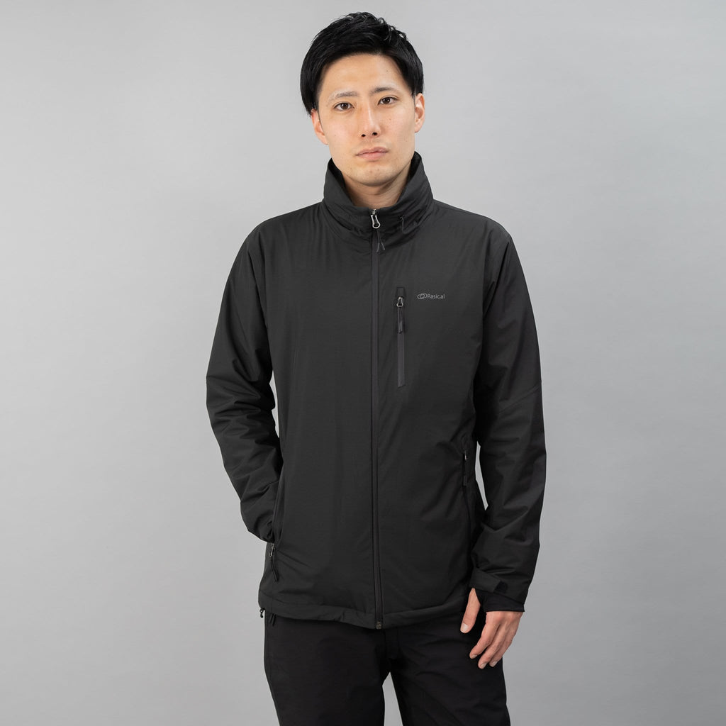
フェアリーノヴァ 2
-196度、NASA使用断熱材×発熱テクノロジー、薄くて軽い万能ジャケット

GrowSpica Pro
人間工学に基づいて作られた、姿勢を保つ超集中ワークチェア

フェアリーノヴァ掛け布団
寒い冬もこれ一枚!宇宙断熱×先端技術、わずか3cmで軽くて暖かい、快適睡眠な掛け布団。

